Where to, pal?

Take a gander at some of my latest work...
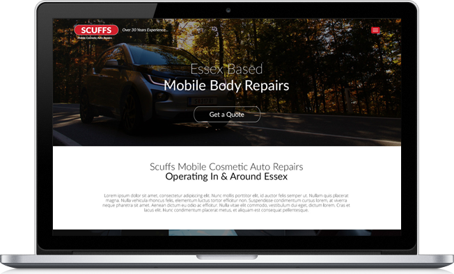
Scuffs - Mobile Body Repairs
Scuffs is a cosmetic auto repairs company in Essex. Going where they're needed and removing scratches, scuffs and dents. They also do complete resprays, windscreen repair, upholstery etc. But enough about them, let's see what I did for them!
I was asked to build them a website to give them an online presence, as they only advertised by word-of-mouth at the time. I'm really happy with the end result. It has a sleek & modern design, clear layout and the information is nicely laid out, with call-to-actions in every section.
Having only a logo to go on, I had quite a lot of creative freedom. After doing a bit of research into Scuffs' competition, I found that they all used old fashioned layouts and over-engaging colour pallettes. I chose to go with a layout that I thought a company like Vauxhall, Ford or VW would use on a landing page. Smart, mordern and engaging. This way, Scuffs would immediately stand out from their competition and appear to provide a better service.
Scuffs stressed that they wanted the main call to action of the site to lead the customer to get in touch with them to get a quote, as they are unable to list prices due to the changing nature of most jobs. So the site has buttons placed regularly throughout the site, gently guiding the user to get in touch. Rather than provide a price list that Scuffs may be unable to stick to.
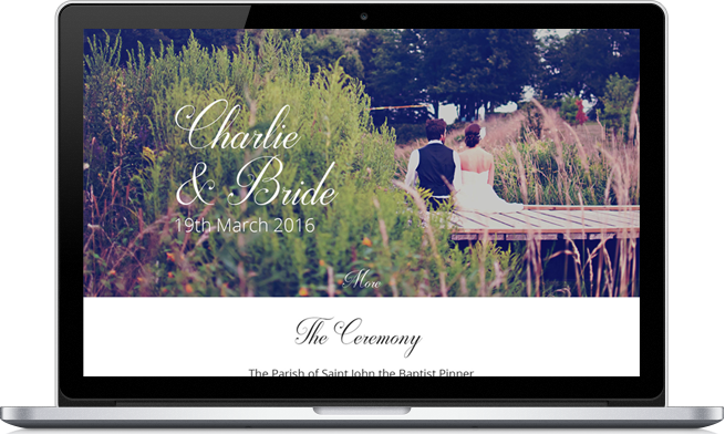
Charlie & Bride's Wedding
A friend of mine got in touch and asked me to design him an online invitation for his wedding. But didn't go as far as to actually invite me... What gives, Charlie!? You think you're better than me!?
There was no real call-to-action for this site. Just a place where guests could find all the information they'll need for the day. So my goal was to lay out the content in a way that made logical sense for a user, and was easily digestible.
The site tells a story, going through the days events from the ceremony to the reception and eventually to the nearest hotels that the guests can stay in at the end of the day.
The brief contained a specific colour scheme I had to adhere by to compliment the wedding. I implemented this in the image overlays and the banners containing the section titles.
The happy couple didn't end up going with the online invitation idea in the end, opting for the more traditional paper printed invites. By this point I had already fallen in love with the design, so I decided to code it and put it on my portfolio anyway.


© Copyright Dan Fulcher 2024